PriceCatch Ultimate Auto Fibonacci LevelsHello and Warm Greetings to TradingView community.
PriceCatch Ultimate Auto Fibonacci Levels
The only Fibonacci Levels script you'll ever need.
The Problem
One of the problems faced by traders who use Fibonacci levels is that they have to draw the levels manually on their charts. It's tedious and sometimes leads to inaccuracies in identifying correct levels.
Secondly, while there are so many Auto Fibonacci scripts available in the Public Scripts Library, most of them are not really useful as they are very limited in their capability for the following reasons:
either they are based on historical bars or historical pivots - user has to enter the number of historical bars or pivots for the starting point of the Fibonacci Levels.
they are time-frame dependent and re-plot levels when chart's time-frame changes. This is a very serious limitation with most scripts.
they do not offer real and practical user settings.
many of them are not actually pure Fibonacci Levels scripts.
Limitations with other Auto Fibonacci scripts
Other Fibonacci scripts ask user to specify a number of historical bars or pivots to draw the Fibonacci levels. This is a major problem with such scripts - because 50 historical bars on the daily time frame changes to 50 historical bars on the 4H if you change the chart's time-frame to 4H, thereby altering the position of the Fibonacci levels. So, the desired view that the user seeks about price action is not what he/she gets whenever the time-frame changes. Similarly with specifying Pivots. For example, for a swing trader who specifies Pivots, the number of pivots that occur in one month varies depending on the chart's time-frame. So after trying these scripts, users quickly realize that these scripts do not serve purpose.
PriceCatch Ultimate Auto Fibonacci Levels - Unparalleled advantage
The PriceCatch Ultimate Auto Fibonacci Levels script that I am publishing is completely different from other Fibonacci scripts on the TradingView Public Library. My script offers users unparalleled flexibility and options to use it effectively and to suit their trading style. With PriceCatch Ultimate Auto Fibonacci Levels script, user has the ability to choose a variety of options to draw the Fibonacci levels from Current Day, Previous Day all the way up to 52 weeks. Not only that, users can also set their own levels via input options and that makes it even more adaptive to a user's specific needs. So, if you do not want 0.382 level and want the level to be at 0.312, yes, you can do that with this script.
Time-frame independence
This script works independent of the chart time frame and this is it's USP. So, while your chart may be set to 15 minutes time-frame, you can set the script to draw Fibonacci levels of Previous Week, last 3 days or any other available interval of your choice and it will draw it accurately. What's more, you can change your chart's time-frame to any interval of your choice and the Fibonnacci levels stay fixed and true to the chosen option. This ability is very helpful to the user because while the Fibonacci levels are drawn based on the chosen interval's high and low, user can then choose any chart time frame to trade on the drawn Fibonacci levels. This is the crucial difference and big advantage of PriceCatch Ultimate Auto Fibonacci Levels script from other scripts.
Chart type independence
PriceCatch Ultimate Auto Fibonacci Levels script is also independent of chart type. You can set your chart to Bars, Japanese, Hollow, Heikin-Ashi or even line style and this script accurately draws the Fibonacci levels as the logic is independent of chart type.
Time series
For traders who combine Time-Series also in their trading set-up with Fibonacci levels, this script includes Time-Series as well to aid those traders.
Highly configurable
With a number of configuration options, PriceCatch Ultimate Auto Fibonacci Levels script offers utmost flexibility and ease of use to every user.
Practical and really useful
I have written the script after careful study of all the other available scripts and only then took on this project. Once you look at other scripts and what they lack, you will realize my script is all-rounded, very flexible with a wide variety of options to choose from. All of these features make PriceCatch Auto Fibonacci Levels script unique, very powerful and highly useful to traders.
Use Cases
Intraday
If you trade intraday, setting the interval to 3D (3 days) will give you Fibonacci levels of last three days. This may be useful in taking intraday trades by knowing probable support and resistance levels in that period. Then, you can trade on 1 minute, 3 minutes, 5 or any other intraday time frame of your choice.
Swing / Long term trading
For swing or long term traders, setting the interval to PM (previous month) or CQ (current quarter) will help you find probable support / resistance levels in that period that you can use to plan your trades. Then, of course, with the 52W setting, you can take a really long term view of the asset.
Multiple Advantage
Since you can add the script more than once to your chart, you can set one script to a longer time frame and another to a shorter one to form a combination of Fibonacci levels to give you even more precise and desired information about price action and to help you plan/manage your trades.
A Sample
GBPUSD with CQ (Current Quarter) setting
NOTE - PRIOR TO USING THIS SCRIPT
Please remember that the script is shared with absolutely no assurances about usability and any warranties whatsoever and as a responsible trader, please satisfy yourselves thoroughly and use it only if you are satisfied it works for you. Remember, you are 100% responsible for your actions. If you understand and accept that, you may use the script.
QUERIES/FEEDBACK
Please PM me.
I have to thank @BJORGUM for helping me out with this script.
Hope you find this script useful. Wish everyone all the best with trading.
在腳本中搜尋"price action"

Boom Hunter XBoom Hunter X is built to target breakouts and explosive moves. The strength of this indicator is in slower timeframes like daily, weekly and monthly but it also works great on 4 hour timeframes. It is a modified version of Boom Hunter XL designed to be simple and easy to use. There are minimal settings available, aside from being able to choose the length of the oscillator there are 3 presets available. Preset 1 is the fastest and is great for targeting entries. Preset 3 is the slowest and is perfect for highlighting trends and setting up big moves. Preset 2 is somewhere in the middle and works great for entries and trend. To get a full picture of price action it is recommended to use all three indicators on your chart. The indicator will automatically adjust lengths when using weekly and monthly charts. If using faster timeframes try adjust the length to 6 or 9.
To get best results use Preset 3 to identify the trend of price action. When Preset 3 is in teal look for long entries on Presets 1 and 2. Likewise, when in red look for shorts. The best entries come from the first pullbacks. Below is an example of entering with the trend.
Using slow charts like weekly and monthly makes it easy to see what is happening with the markets. Below is an example of how easy it is to stay ahead of the curve and identify booms.
First pullbacks are signalled with outlined triangles: ▵▿
These signals are only available on preset 2 and 3. First pullbacks are picked up after price action breaks its median or dynamic median also known as OSC3 (OSC3 is hidden and works in the background), The strongest long pullbacks are when the oscillator is above the median and in the teal. Likewise the strongest short entries are when the oscillator is below the median and in the red. First pullback signals often signal the start of a new trend. Below is an example on a daily chart.
Breaks in support and resistance are signalled with white arrows: ˰˅
Preset 3 highlights the biggest breakouts while preset 1 will show the breaks within the breaks. Preset 2 provides a nice blend between the both and works great for targeting breakouts. It is not recommended to enter on the break as price action will come back to test. The first pullback after the break is typically the best and safest entry for breakouts. Below is an example of the break signal using preset 2 on weekly chart.
Breakout entries are signalled with teal and red triangles. Breakout signals filter price action for safe confirmed pullback entries. The slower the timeframe the bigger the breakout. Presets 2 and 3 are best for finding these entries.
Booms are signalled with this explosive icon: 💥
Simply put booms are polarity flips within the ticker signal. They are fast and explosive moves that can be detected using several different methods. Some of these boom signals are picked up using pure chart mechanics while others use filtering and signal processing to pinpoint the exact moment before an explosion. To make big moves the charts have to set it up first. Below is an example on a daily chart.
Boom Hunter X comes with the following alerts:
Overbought - Reversal attempt
Oversold - Reversal attempt
Long First Pullback - Only available on Preset 2 and 3
Short First Pullback - Only available on Preset 2 and 3
Pivot Up - Oscillator crosses over trigger
Pivot Down - Oscillator crosses under trigger
Long Breakout - Entry point for breakout
Short Breakout - Entry point for breakout
Break Support - Price action breaks its support
Break Resistance - Price action breaks its resistance
Boom! - Alerts for all the booms
Crossing Over Median - Price action enters top half of channel
Crossing Under Median - Price action enters bottom half of channel

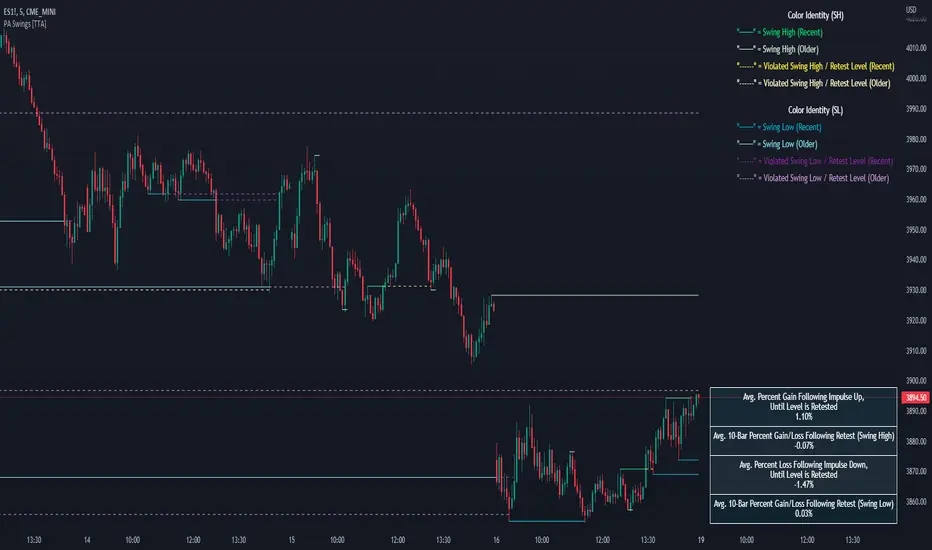
PA Swings [TTA]Hello traders!
This script helps identify swing high levels of resistance and swing low levels of support via price action.
The indicator is designed to help identify support and resistance by measuring retracements. When the retracement has reached the threshold, the indicator identifies the high or low with a horizontal, solid line.
This line will continue until it is violated. Once it is violated it will adjust to a dashed line and continue until it is violated again (retested).
Therefore, a solid line resembles an unviolated swing level; a dashed line resembles a violated swing level that has yet to be retested.
Ideally, this script will filter some movements by identifying impulses in the market. Knowing that price is in a trending move rather than bouncing around in a range can help traders in their analysis. In range bound conditions the indicator will show small impulses, sometimes trapped by a support and/or resistance line. In trending markets there will be separation between the support and resistance lines.
Retests are also identified by the indicator.
Retests of swing highs and lows may induce precise, repeatable price moves - something a trader might find advantageous. A log is included to help identify potential price levels based on historical actions when an impulse or a retest occurs.
Consequently, this may help traders identify take-profit targets and avoid stop losses that are too close to the entry point.
The indicator has a color identity panel to help you get familiar with the colored lines, line types, and what they mean. The color panel is concealable. Additional customization options are available, such as toggling the chart labels. These labels distinguish impulses up and down, retests, and the distance price has traveled since breaking or creating a support or resistance level.
This can be toggled off. A High-Volume Swings only option is available for those that wish to filter out low volume movements (such as extended market hours).
You also have the option of hiding far away lines and can define what is “far away” for them % wise. It is defaulted to 15% which may need to be adjusted on lower timeframes.
Inactive lines can be shown or they can be removed in the settings as well. While this indicator can find some great levels of support or resistance it is important to remember that, should you find this script helpful, it is a tool in your toolbox!! (:
Hope you enjoy and thank you for checking this out!
Magnifying Glass (LTF Candles) by SiddWolf█ OVERVIEW
This indicator displays The Lower TimeFrame Candles in current chart, Like Zooming in on the Candle to see it's Lower TimeFrame Structure. It plots intrabar OHLC data inside a Label along with the volume structure of LTF candle in an eloquent format.
█ QUICK GUIDE
Just apply it to the chart, Hover the mouse on the Label and ta-da you have a Lower Timeframe OHLC candles on your screen. Move the indicator to the top and shrink it all the way up, because all the useful data is inside the label.
Inside the label: The OHLC ltf candles are pretty straightforward. Volume strength of ltf candles is shown at bottom and Volume Profile on the left. Read the Details below for more information.
In the settings, you will find the option to change the UI and can play around with Lower TimeFrame Settings.
█ DETAILS
First of all, I would like to thank the @TradingView team for providing the function to get access to the lower timeframe data. It is because of them that this magical indicator came into existence.
Magnifying Glass indicator displays a Candle's Lower TimeFrame data in Higher timeframe chart. It displays the LTF candles inside a label. It also shows the Volume structure of the lower timeframe candles. Range percentage shown at the bottom is the percentage change between high and low of the current timeframe candle. LTF candle's timeframe is also shown at the bottom on the label.
This indicator is gonna be most useful to the price action traders, which is like every profitable trader.
How this indicator works:
I didn't find any better way to display ltf candles other than labels. Labels are not build for such a complex behaviour, it's a workaround to display this important information.
It gets the lower timeframe information of the candle and uses emojis to display information. The area that is shown, is the range of the current timeframe candle. Range is a difference between high and low of the candle. Range percentage is also shown at the bottom in the label.
I've divided the range area into 20 parts because there are limitation to display data in the labels. Then the code checks out, in what area does the ltf candle body or wick lies, then displays the information using emojis.
The code uses matrix elements for each block and relies heavily on string manipulation. But what I've found most difficult, is managing to fit everything correctly and beautifully so that the view doesn't break.
Volume Structure:
Strength of the Lower TimeFrame Candles is shown at the bottom inside the label. The Higher Volume is shown with the dark shade color and Lower Volume is shown with the light shade. The volume of candles are also ranked, with 1 being the highest volume, so you can see which candle have the maximum to minimum volume. This is pretty important to make a price action analysis of the lower timeframe candles.
Inside the label on the left side you will see the volume profile. As the volume on the bottom shows the strength of each ltf candles, Volume profile on the left shows strength in a particular zone. The Darker the color, the higher the volume in the zone. The Highest volume on the left represents Point of Control (Volume Profile POC) of the candle.
Lower TimeFrame Settings:
There is a limitation for the lowest timeframe you can show for a chart, because there is only so much data you can fit inside a label. A label can show upto 20 blocks of emojis (candle blocks) per row. Magnifying Glass utilizes this behaviour of labels. 16 blocks are used to display ltf candles, 1 for volume profile and two for Open and Close Highlighter.
So for any chart timeframe, ltf candles can be 16th part of htf candle. So 4 hours chart can show as low as 15 minutes of ltf data. I didn't provide the open settings for changing the lower timeframe, as it would give errors in a lot of ways. You can change the timeframe for each chart time from the settings provided.
Limitations:
Like I mentioned earlier, this indicator is a workaround to display ltf candles inside a label. This indicator does not work well on smaller screens. So if you are not able to see the label, zoom out on your browser a bit. Move the indicator to either top or bottom of all indicators and shrink it's space because all details are inside the label.
█ How I use MAGNIFYING GLASS:
This indicator provides you an edge, on top of your existing trading strategy. How you use Magnifying Glass is entirely dependent on your strategy.
I use this indicator to get a broad picture, before getting into a trade. For example I see a Doji or Engulfing or any other famous candlestick pattern on important levels, I hover the mouse on Magnifying Glass, to look for the price action the ltf candles have been through, to make that pattern. I also use it with my "Wick Pressure" indicator, to check price action at wick zones. Whenever I see price touching important supply and demand zones, I check last few candles to read chart like a beautiful price action story.
Also volume is pretty important too. This is what makes Magnifying Glass even better than actual lower timeframe candles. The increasing volume along with up/down trend price shows upward/downward momentum. The sudden burst (peak) in the volume suggests volume climax.
Volume profile on the left can be interpreted as the strength/weakness zones inside a candle. The low volume in a price zone suggests weakness and High volume suggests strength. The Highest volume on the left act as POC for that candle.
Before making any trade, I read the structure of last three or four candles to get the complete price action picture.
█ Conclusion
Magnifying Glass is a well crafted indicator that can be used to track lower timeframe price action. This indicator gives you an edge with the Multi Timeframe Analysis, which I believe is the most important aspect of profitable trading.
~ @SiddWolf

Wizard AlgoWizard Algo:
==============================
Features of the indicator:
- BULL/BEAR Signals
- TP (Take-Profit) and Exit System
- Possible Reversal Signals
- Reversal Scalper
- Reversal Bands
- Trend Bar Colors
- Auto Support/Resistance Levels
- Auto Trend-Lines
================================
Description:
1. Signals: The signals consists of 2 different approaches and the users can choose which signal type they want to use. The indicator gives bull/bear signals based on certain condition, such as trend and momentum. The "TP" signals stands for "Take Profit." These signals help users to decide when to take profits or liquidate all position. The Indicator includes an exit system that can used as another means of closing a position. The exit system uses a 1.5x risk to reward ratio to determine where to keep the take profit and stop loss target.
2.Reversal Scalper: Reversal scalpers are the tiny up(aqua) and down(fuchsia) triangles on the chart. These signals a possible reversal in the price and they can be used to enter a scalping trade. The signals uses mainly momentum and candle price action to determine when there could be a possible reversal in price.
3. Reversal Bands: The reversal band is the green/red cloud like indicator. This can help determine when a price is oversold and therefore, it could reverse. Same goes for the short side, if price is in the overbought territory, then it could reverse to the downside. The reversal bands uses mainly volatility. This is not the same thing as Bollinger bands.
4. Bar Colors: The candle bar colors helps to determine the current trend. The colors are given based on the current trend. The colors lime/red shows strong trend, and orange/cyan/blue shows weak trend.
5. Auto S/R and Auto trendlines: These indicators can be used for determining price actions. Both of these work in similar manner. They mainly look at the previous pivots and draws a line connecting the pivots. S/R are the horizontal lines and the trendline have angles to them.
Heatmap VWAP Forex v1This is an indicator for those subscribed to the Crash Course Trading Programme. It shows where the VWAP is in relation to current price action.
It is recommended you open this heat map using the TV trading view desktop and display it on one tab. It is also recommended you keep it on the EURUSD tab.
For all currency pairs it picks up the price action and volume from OANDA so you dont have to scan these charts looking for trades. It is strongly recommended you use OANDA as this has volume within the signal which is necessary to calculate the VWAP.
It covers the following forex pairs and these are in each column designated by the corresponding two letter abbreviation:
CLMN
1. EU – EURUSD
2. EG – EURGBP
3. EC – EURCHF
4. GU – GBPUSD
5. AU – AUDUSD
6. UJ – USDJPY
7. UC – USDCHF
8. AJ – AUDJPY
9. UL – USDCAD – L stands for Loonie
10. NU – NZDUSD
11. GJ – GBPJPY
12. EA – EURAUD
13. AL – AUDCAD – L stands for Loonie
Price action is at the VWAP when the column cell is bellow as indicated by the yellow box on the left hand side of the heatmap.
If the cell is red, it means that price action is below the VWAP.
If the cell is green, it means that the price is above the VWAP.
The higher it is above or below the VWAP it shows the box being higher or lower than the yellow row and is indicated by +/- Standard Deviation on the left hand side.
The aspects we are looking for are:
1. A gradient.
2. A pullback after price action has passed through the vwap.
3. You need a good reversal bar such as a engulfing / pinbar or high/low test bar or traintracks or day/morning star. These are some examples and you are not limited to just these. If you need help with candlesticks please get in touch and we will cover this to ensure you know what types of candlesticks you are looking for.
4. Look for confirmation with Stochastic RSI 3, 3, 9, 21 or Stoch 5,3,3 or what you like in this regard. It is a momentum indicator and overbought and undersold does apply to it. It indicates the energy that price action has, not necessarily zones where you can sell or buy.
5. Divergence. Again, if you do not fully understand this topic get in touch and we can go through this.
Remember, WITHOUT a gradient you have no trade. If there is no trade there today, that is fine, there is no desperate need to trade straight away.
Please add any comments to how useful you find this or if you would like improvements and I will see what I can do.

Clutch AlgoThe Clutch Algo provides reversal signals and trend signals. The indicator can be used for stocks, crypto and forex. It can also be used for day trading and swing trading.
Reversal signals were done by modifying the Bollinger Bands and MACD and combining them in a unique way to find explosive price actions. These have been modified to provide signals at the bottom or top of a trend to catch price reversals and to improve margin of safety on trades. These signals are labeled as “Long” and “Short”.
We also added automatic support and resistance zones to increase the accuracy of the “Long” and “Short” signals. This was done by using historical price action of highs and lows and periods of consolidation where price reversed.
The trend signals, which are labeled as “Bull” and “Bear” signals use a combination of exponential moving averages. These signals can be used as trend continuations.
We also added an exponential moving average cloud to help traders easily visualize trend. This can be used as a guide to help you stay in a trade to maximize profits. It can also be used as a guide to get out of a trade if price breaks out of the cloud. The third use of the cloud can be used as support resistance in between high/low support and resistance zones.
Tips:
- Only take long/short signals when there is a support or resistance zone formed at or near the long/short signal, preferably within 1-3 bars of the support or resistance zone. Signals too far from "Long" or "Short" signals reduces your margin of safety.
- When in a Long or Short position, use support or resistance zones as a stop loss level as price is likely to go against the position.
- When taking a Long/Short or Bull/Bear signal, wait for candles to be completed to get best entry possible.
- Previous support zones can be used as resistance zones and previous resistance zones can be used as support zones.
- The support and resistance (SR) period can be adjusted. Numbers in the SR settings are bars looking back. For example, a setting of 10, looks back 10 bars.
PriceCatch Auto Fibonacci - IOHello and Warm Greetings to Tradingview community.
PriceCatch Auto Fibonacci Levels
The Problem
One of the problems faced by traders who use Fibonacci levels is that they have to draw the levels manually on their charts. It's tedious and sometimes leads to inaccuracies in identifying correct levels.
Secondly, while there are so many Auto Fibonacci scripts available in the Public Scripts Library, most of them are not really useful as they are very limited in their capability for the following reasons:
either they are based on historical bars or historical pivots - user has to enter the number of historical bars or pivots for the starting point of the Fibonacci Levels.
they are time-frame dependent. This is a very serious limitation with most scripts.
they do not offer real and practical user settings.
many of them are not actually pure Fibonacci Levels scripts.
Limitations with other Auto Fibonacci scripts
Other Fibonacci scripts ask user to specify a number of historical bars or pivots to draw the Fibonacci levels. This is a major problem with such scripts - because 50 historical bars on the daily time frame changes to 50 historical bars on the 4H if you change the chart's time-frame to 4H, thereby altering the position of the Fibonacci levels. So, the desired view that the user seeks about price action is not what he/she gets whenever the time-frame changes. Similarly with specifying Pivots. For example, for a swing trader who specifies Pivots, the number of pivots that occur in one month varies depending on the chart's time-frame. So after trying these scripts, users quickly realize that they are not really all that useful.
PriceCatch Auto Fibonacci Levels - Unparalleled advantage
The PriceCatch Auto Fibonacci Levels script that I am publishing is completely different from other Fibonacci scripts on the TradingView Public Library. My script offers users unparalleled flexibility and options to use it effectively and to suit their trading style. With PriceCatch Auto Fibonacci Levels script, user has the ability to choose a variety of options to draw the Fibonacci levels from Current Day, Previous Day all the way up to 52 weeks. Not only that, users can also set their own levels via input options and that makes it even more adaptive to a user's specific needs. So, if you do not want 0.382 level and want the level to be at 0.312, yes, you can do that with this script.
Time-frame independence
This script works independent of the chart time frame and this is it's USP. So, while your chart may be set to 15 minutes time-frame, you can set the script to draw Fibonacci levels of Previous Week, last 3 days or any other available interval of your choice and it will draw it accurately. What's more, you can change your chart's time-frame to any interval of your choice and the Fibonnacci levels stay fixed and true to the chosen option. To my knowledge, none of the other scripts offer such a feature as they are dependent on the Chart's time frame.
The Difference
With the PriceCatch Auto Fibonacci Levels script, when user chooses Previous Month to draw Fibonacci levels, it only considers the high and low of previous month and this can never change. This makes it time-frame independent and actually helpful to the user because while the Fibonacci levels are drawn based on the chosen interval's high and low, user can then choose any chart time frame to trade on the drawn Fibonacci levels. This is the crucial difference and big advantage of PriceCatch Auto Fibonacci Levels script from other scripts.
Chart type independence
PriceCatch Auto Fibonacci Levels script is also independent of chart type. You can set your chart to Bars, Japanese, Hollow, Heikin-Ashi or even line style and this script accurately draws the Fibonacci levels as the logic is independent of chart type.
Practical and really useful
I have written the script after careful study of all the other available scripts and only then took on this project. Once you look at other scripts and what they lack, you will realize my script is all-rounded, very flexible with a wide variety of options to choose from. All of these features make PriceCatch Auto Fibonacci Levels script unique, very powerful and highly useful to traders.
Use Cases
Intraday
If you trade intraday, setting the interval to 3D (3 days) will give you Fibonacci levels of last three days. This may be useful in taking intraday trades by knowing probable support and resistance levels in that period. Then, you can trade on 1 minute, 3 minutes, 5 or any other intraday time frame of your choice.
Swing / Long term trading
For swing or long term traders, setting the interval to PM (previous month) or CQ (current quarter) will help you find probable support / resistance levels in that period that you can use to plan your trades. Then, of course, with the 52W setting, you can take a really long term view of the asset.
Multiple Advantage
Since you can add the script more than once to your chart, you can set one script to a longer time frame and another to a shorter one to form a combination of Fibonacci levels to give you even more precise and desired information about price action and to help you plan/manage your trades.
Some Samples
Tesla with CQ (Current Quarter) setting
Microsoft with CM (Current Month) setting
NVAX Bar Chart in 2H with PM (Previous Month) setting
NOTE - PRIOR TO USING THIS SCRIPT:
Please remember that the script is shared with absolutely no assurances about usability and any warranties whatsoever and as a responsible trader, please satisfy yourselves thoroughly and use it only if you are satisfied it works for you. Remember, you are 100% responsible for your actions. If you understand and accept that, you may use the script.
Why Invite only?
I merely want to know how many traders actually show interest to use it.
QUERIES/FEEDBACK
Please PM me.
I have to thank @BJORGUM for helping me out with this script.
Hope you find this script useful. Wish everyone all the best with trading.
LT Elliott WavesLT Elliott Waves Indicator:
According to Elliott Wave Theory, price moves in 5 waves in the direction of the major trend and moves in 3 waves (ABC) when it moves against the major trend. The key purpose and value of elliott wave theory (EWT) is to provide context for chart analysis. According to the book The Elliott Wave Principle by Frost & Prechter: “This context provides both a basis for disciplined thinking and a perspective on the market's general position and outlook.” The benefit of having context is that one can identify and anticipate changes in direction.
In Elliott Wave theory, waves 1, 3, 5 and C are impulse waves (a five wave pattern that makes progress) whereas waves 2, 4, A and B are corrective waves (a three wave pattern – or combination of three waves - that moves against the direction of the larger trend). Although wave A can also be formed of 5 waves, it is commonly formed of 3 waves. Here is a brief summary of the waves:
Wave 3 tends to be the strongest and most dynamic wave – it is usually (but not always) the longest wave but it is never the shortest. Wave 4 is a corrective wave that is typically composed of 3 smaller waves (ABC) and is notorious for being messy and unpredictable in nature. Wave 5 is the final wave before a significant correction or reversal in trend and is often accompanied by divergences (e.g. negative divergences in an uptrend) and exhaustions in momentum. It is also possible for a wave 5 to form after a “blow-off top” pattern. Wave 2 is composed of 3 smaller waves (ABC) and is a retracement of wave 1 – the retracement can be shallow to moderate (23.6% to 38.2%) or deep (50%, 61.8% to 78.6%). Wave 1 is the first wave of a trend and is composed of 5 smaller waves – it usually occurs after divergences (in the prior move) and extremes in both sentiment and momentum. For example, the wave 1 of an uptrend can often begin after capitulation in the price (after a major decline), extremely pessimistic sentiment, extremely oversold momentum readings, positive divergences and sometimes accompanied by a volume breadth thrust. Waves A and C are often equal in measure. Wave A can be formed of either 5 waves or 3 waves - but more commonly it is composed of 3 waves. Wave B is always corrective and composed of 3 smaller waves. Wave C is a five wave impulse pattern.
The Elliott Wave indicator (and addendum) seeks to simplify elliott wave theory (EWT) in that its main purpose is to identify the potential major trends and corrections. The indicator takes a more simple and direct approach to EWT in that it focuses more on trying to identify whether price is trending or not and if so, the probable wave pattern. It does this by mainly using the structure of the price chart and sometimes other factors such as divergences, momentum and the relationship of price to its key averages. The indicator then takes its best guess at whether price is in a trending environment, and if so, which wave it is probably forming. The wave count can therefore depend on the chart timeframe chosen. For example, what may appear as a major downtrend on a lower timeframe chart may potentially be a corrective drop on a much higher timeframe, due to the different price structure of the charts. To keep things simple and to avoid complexity, the indicator does not display the minor sub-waves within the major waves (probably with the exception of wave 4).
The main feature and benefit of the Elliott Wave indicator is that it can remove subjectivity in chart and wave analysis. It also for flexibility in that it allows the chartist to alter the wave count and the position of the wave counts if they choose to do so (within the parameters and rules set by the indicator). As with all of technical analysis, the wave counts shown by the elliott wave indicator are NOT certain – they are only a possibility or a probability. So the risk always exists of an alternative wave count. It is for the chartist to determine the probable wave counts and limit or control the risks based on their knowledge of technical analysis and risk management.
The settings of the Elliott Wave indicator are fairly self-explanatory but here is a brief summary:
By default the indicator is set to a strict setting (“Alt 8”) in that it waits for divergences or exhaustions in momentum before a probable wave 5 is shown (i.e. the fifth wave within the elliott five wave pattern). So for example, in an uptrend, the indicator may show a probable “wave 3” if there are no negative divergences. Once a divergence appears then the indicator may change the wave count to a “wave 5” provided the parameters for this wave count have been met. This default setting can be changed and removed if the chartist wishes to do so. So if the user wants to change the wave count from a probable “wave 5” to a potential “wave 3”, then the Alt 8 setting can be unselected (i.e. unticked) in the settings and then the Alt 1 can be selected. The indicator will then display a “wave 3” count until the price reverses and breaks below a key support level, thus changing the wave count from a “3” to a probable “5”. (The opposite of this example applies in downtrends.) A strict criteria setting is provided for charts of crypto.
The Elliott Wave indicator has options in the settings to change the positions of certain wave counts based on the structure of the chart. This is achieved by choosing the different major and minor structures based on the zigzag patterns of the chart. So the user can alter the positions of certain wave counts (if needed) by modifying the zigzag structure on the chart.
The lookback period in the settings can be increased (or decreased) to include more data on the chart, when needed. In the majority of situations the lookback period can remain at the default setting of 200 bars – but the user can decide to take into account more (or less) data by changing the lookback period to 300 (or 100 if less data is required).
In the elliott wave indicator, the potential major wave counts are shown in blue and the likely ABC counts (for wave 4) are shown in yellow. The starting point for the wave counts is shown as a green “wave 5” – this is referred to as the “historical wave 5” as it is the likely fifth wave of the prior wave. (For the most recent probable wave counts, such as ABC or 123, this is covered in the elliott wave addendum indicator).
The position of the wave counts, such as waves 1 & 2, 3, 4 and the historical wave 5 (in green) can be changed and modified to a reasonable degree. The historical wave 5 is the starting point where the indicator starts “counting” the waves. The indicator makes its best guess as to where to start counting from the historical wave 5, but the user has the option to change its position, if required as per the parameters set by the indicator. When the position of the green historical wave 5 is changed, this usually affects the entire wave count. The position of the historical wave 5 (green) can be changed by Alt6 in the settings of the elliott wave indicator. Alt4 can change the positions of waves 1 and 2 in the indicator. Alt5 can modify the position of the ABC waves within wave 4 (although by default they are set to major points on the chart). The position of wave 3 can be changed by Alt7. For wider “jumps” in the position of wave 3 and wave 5, the wider jump option can be enabled in the settings. For example, “Alt7Jump” has three ways of moving (or “jumping”) the wave 3 called J1, J2 and J3. The position of most wave counts can also be altered by modifying the major and minor structures or zigzag (which can sometimes change the wave count as well).
If the chartist decides to delay the changing of the wave count, such as delaying the change of wave 3 to a wave 5, then the option Alt10 “Delayed wave count” can be enabled. For example, if the indicator displays a probable “wave 5” on the chart, Alt10 can be enabled to change the wave count to a probable “wave 3” if the chartist decides it is reasonable or “logical” to do so. The Alt10 is similar to Alt1 in that both affect waves 3 and 5. However, Alt10 is less strict than Alt1 so it can often change the wave 5 to a wave 3 in the majority of situations. If Alt10 is enabled, it may be a good idea to ensure that the elliott wave addendum indicator is set to display an ABC wave count (instead of the 123) within the settings.
In certain circumstances where there are volatile conditions and charts, it is possible that the elliott wave indicator may show an “unusual” wave count. For example, it is possible that the positions of certain wave counts (such as waves 1, 2, 3 and 5) may be in the “wrong” order. This happens rarely so it is not an issue that happens very often. However, if this issue occurs, the chartist can rectify the matter by first increasing the lookback period (e.g. to 300) to see if this resolves the issue. If it does not, then Alt9 “temporary wave shift” in the elliott wave addendum can be enabled as this can usually resolve the issue and show the wave counts in a “proper” manner. Changing to a slightly lower timeframe can also usually resolve this issue. If Alt9 is enabled, care should be taken to unselect this option at a later date (as it is only a temporary solution).
The aggressive wave count setting (called “Aggressive 123”) is mainly for the addendum of the elliott wave indicator (i.e. EW addendum). Enabling this option can often change the wave count from an ABC to a 123 provided this is permitted by the parameters of the indicator. This option as well as others are included for further flexibility in the wave count.
The user can also choose to enable the zigzags of the waves to be shown on the chart. This can display the minor and major wave structures and zigzags, if enabled. By default it is set to off. It may also be a good idea to reset the settings of the indicators whenever a new chart or timeframe is chosen. This then refreshes the settings back to its default.
It is important to appreciate that the elliott wave indicator generally requires between 1,500 to 2000 bars of data on the chart in order to display the wave counts adequately and appropriately. So if a chart or timeframe has less than the minimum number of historical data or bars on the chart, the wave counts may not display properly or not appear at all. Certain chart symbols and timeframes (such as the monthly timeframe) may have very limited amount of data on them. Therefore, the elliott wave indicator will likely not appear on these charts or may not display properly. In these situations, a different chart symbol or a lower timeframe with more data on it can be chosen. For example, instead of a monthly timeframe, a weekly or daily timeframe can be chosen.
As mentioned, the elliott wave indicator is programmed to look for and identify potential trending patterns (as well as corrective patterns). In this sense, we are looking to simplify elliott wave theory by taking a more flexible and common-sense approach to the wave patterns. So if the price action has broken key levels of support or resistance, momentum is increasing and price is moving deliberately in a specific direction, it becomes more likely that price is in a trending environment (rather than just a correction).
If the main elliott wave indicator (i.e. LT Elliott Waves) is showing a probable wave 3, and price begins to pullback or move in the opposite direction to the main trend of the wave 3, the EW addendum may be used to display the probable ABC wave counts. These ABC wave counts could be for the likely wave 4 correction. However, if price starts to break key support levels (e.g. after an uptrend) and then reverse lower in the opposite direction (to the mentioned wave 3), then it is likely that the main indicator will change the wave count from a wave 3 to a wave 5. This can indicate that the main uptrend may have probably ended and that we are in either a large correction or a trend reversal, as shown by the EW addendum. This example can also apply in reverse for downtrends e.g. if price starts to break resistance levels and move higher after a downtrend.
We have allowed for further flexibility in the main elliott wave indicator i.e. LT Elliott Waves (and the EW addendum) so that the user can change the wave counts, if required. For example, the chartist can change the wave count from a probable wave 5 to a potential wave 3 – or a probable 123 to ABC (or vice versa) if they choose to do so. Further explanation and information is provided in the description for EW addendum. The position of the wave counts can be changed as well to a reasonable degree.
The chartist can apply other methods of chart analysis – such as trendline breaks, oscillators, regression channels, breaks of support/resistance – to determine when a probable wave (or wave count) has likely completed. For example, technical analysis methods such as trendline breaks and support/resistance breaks can be used by the chartist to determine the probability of whether wave 4 has potentially completed or not. In an uptrend, confirmation that a probable wave such as wave 4 has completed will not come until price has taken out the highs prior to the decline (i.e. the highs before the pullback in the probable “wave 4” correction). The same applies in reverse for a downtrend: confirmation that the probable wave 4 has completed will not come until price has taken out the lows prior to the rally (in a probable wave 4 correction).
It should be remembered that the appearance of the most recent wave counts (or wave labels) shown by the indicator, by themselves do NOT mean that the specific waves in question have definitely completed or finished. Nothing in chart analysis is certain or definite. The wave label itself is simply an indication that the most recent wave is probably still in progress, not necessarily that it has completed. Chartists can apply other technical analysis tools and methods (e.g. trend lines, support/resistance breaks, moving averages and regression channels etc.) to increase the probability of when a specific wave has probably completed. The same also applies to past or “completed” wave counts (or past wave labels): they do NOT mean that the specific waves have definitely completed or finished – it is merely a possibility or probability. So the risk always exists that the wave counts may potentially be wrong, and that an alternative wave count interpretation may exist.
Price action, markets and their charts are non-linear and chaotic, which means that they are subject to uncertainty, variable change and being unpredictable in nature. So we must maintain a probabilistic mindset and attitude to technical analysis. Nothing is certain. Therefore, no wave count is certain or “set in stone”. Wave counts, just like the actions and emotions of human beings, are subject to change. Elliott Wave theory, just like all of technical analysis is about what is possible, what is probable and what the risks are of a particular outcome. The advantage of elliott wave theory, as explained previously, is about gaining an understanding of context and the likely big picture. The indicator is provided in good faith but we do not vouch for its accuracy.
As mentioned previously, chartists should be aware of the probabilistic and uncertain nature of price action and the markets, and therefore prepare to limit and control any potential risks.
The indicator can be used on the charts of the majority of markets (e.g. stocks, indices, ETFs, currencies, cryptocurrencies, precious metals, commodities etc.) and any timeframe. Nothing in this indicator, its signals or labels should be construed as a recommendation to buy or sell any market (e.g. stocks, securities, indices, ETFs, currencies, cryptocurrencies, metals, commodities etc.). The indicator is provided solely for educational purposes, to gain a better understanding of technical analysis and elliott wave theory. It should be noted that the degree of noise and randomness increases significantly on lower timeframes. So the lower the timeframe that is chosen (e.g. 15-min or lower) the greater the degree of noise and randomness and therefore the higher the frequency of false signals or whipsaws. The indicator can be applied to candlestick charts and bar charts.
If you would like access, please send me a PM on Tradingview.

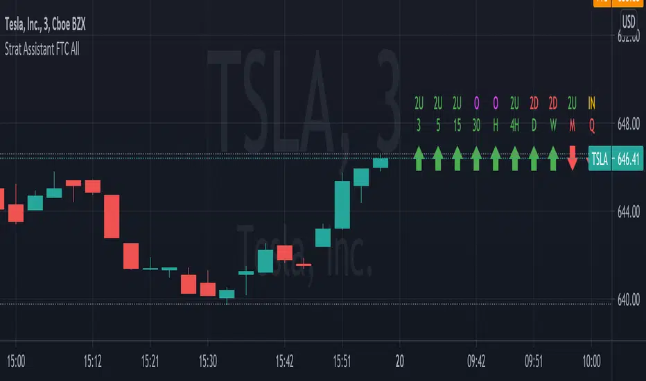
Strat Assistant FTC OnlyStrat Assistant FTC Only
----------------------------
█ OVERVIEW
This script is intended to provide full time frame continuity information for almost all time frames (3, 5, 15, 30, 60, 4H, Day, Week, Month, Quarter)
When added, the script provides a visual indicator to the right at the current price level with indicators for the various time frames in terms of price action and candle type.
█ DETAIL
----------
Output
Time Frames: 3min, 5min, 15min, 30min, 60min, 4 Hour, Day, Week, Month Quarter
Time Frame Labels: 3, 5, 15, 30, 60, H, 4H, D, W, M, Q
Current Candle Time Frame Price Action: displayed below time frame labels. RED + Arrow Down (open > close) or GREEN + Arrow Up (open =< close)
Time Frame Compare: displayed above time frame labels. Current high/low vs prior high/low are compared. IN = Inside/Yellow (current high/low inside prior), O = Outside/Fuchsia (current high/low both greater and less than prior high/low), 2U = Up/Green (current high higher than prior, and low not lower), 2D = Down/Red (current lows lower than prior lows, and high not higher)
Will not show time frames lower than the one currently selected
Best Practices
----------
Had to decouple this from the other scripts because Trading View limits how much you can plot/show
May be a little slow at times, analyzing a lot of time periods/data be patient.
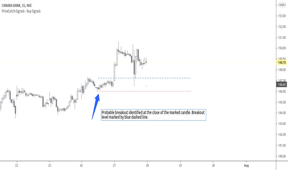
PriceCatch-Signals - Buy SignalsHi,
TradingView Community.
Here is a script that identifies and marks two different buy levels on the chart. It works on all asset classes - equities, forex, crypto.
Probable Breakout Buy Level
Stop-Reverse Buy Level
The bottom images are self-explanatory.
PROBABLE BREAKOUT BUY LEVEL EXAMPLE:
STOP-REVERSE BUY LEVEL EXAMPLE:
IDENTIFICATION OF LEVELS:
The Blue Dotted line represents Probable Breakout Buy Level and the Blue Dashed Line Stop-Reverse Buy Level. The corresponding Red Dotted line below each level should be your initial stop loss price point.
PLAYING SAFE
After taking the trade, to play safe, I follow this method that once the Low of the price goes above the Buy Level, I usually shift the stop loss to buy price to protect against any sudden reversal. For me protecting capital is important. As usual with price action, longer time-frames produce more reliable signals.
NOTE - PRIOR TO USING THIS SCRIPT:
The script uses Heikin-Ashi Candles data to identify the levels. You may use this script in addition to your other indicators or in isolation. Please remember that the script is shared with absolutely no assurances and warranties whatsoever and as a responsible trader, please satisfy yourselves thoroughly and use it only if you are satisfied it works for you. Remember, you are 100% responsible for your actions. If you understand and accept that, you may use the script. The script does not identify any short signals.
ADDITIONAL NOTE:
I shall also be releasing Screener scripts that scan the following markets for the above two conditions or signals thereby helping traders spot opportunities at the right time by making the task of finding right stocks a breeze.
NASDAQ Stocks Screener (Can screen a total number of 160 stocks. 40 stocks at a time)
UK LSE Stocks Screener (Can screen a total number of 90 stocks. 30 stocks at a time)
Euronext Paris Stocks Screener (Can screen a total number of 50 stocks. 25 stocks at a time) - in development.
Singapore Stocks Screener is in development
Other International exchanges will be added based on response from users.
SOME MORE CHARTS:
QUERIES/FEEDBACK
Please PM me.
Regards to all and wish everyone all the best with trading.
PriceCatch-Signals - Buy SignalHi,
TradingView Community.
Here is a script that identifies and marks two different buy levels on the chart. It works on all asset classes - equities, forex, crypto.
Probable Breakout Buy Level
Stop-Reverse Buy Level
The bottom images are self-explanatory.
PROBABLE BREAKOUT BUY LEVEL EXAMPLE:
STOP-REVERSE BUY LEVEL EXAMPLE:
IDENTIFICATION OF LEVELS:
The Blue Dotted line represents Probable Breakout Buy Level and the Blue Dashed Line Stop-Reverse Buy Level. The corresponding Red Dotted line below each level should be your initial stop loss price point.
PLAYING SAFE
After taking the trade, to play safe, I follow this method that once the Low of the price goes above the Buy Level, I usually shift the stop loss to buy price to protect against any sudden reversal. For me protecting capital is important. As usual with price action, longer time-frames produce more reliable signals.
NOTE - PRIOR TO USING THIS SCRIPT:
The script uses Heikin-Ashi Candles data to identify the levels. You may use this script in addition to your other indicators or in isolation. Please remember that the script is shared with absolutely no assurances and warranties whatsoever and as a responsible trader, please satisfy yourselves thoroughly and use it only if you are satisfied it works for you. Remember, you are 100% responsible for your actions. If you understand and accept that, you may use the script. The script does not identify any short signals.
ADDITIONAL NOTE:
I shall also be releasing Screener scripts that scan the following markets for the above two conditions or signals thereby helping traders spot opportunities at the right time by making the task of finding right stocks a breeze.
NASDAQ Stocks Screener (Can screen a total number of 160 stocks. 40 stocks at a time)
UK LSE Stocks Screener (Can screen a total number of 90 stocks. 30 stocks at a time)
Euronext Paris Stocks Screener (Can screen a total number of 50 stocks. 25 stocks at a time) - in development.
Singapore Stocks Screener is in development
Other International exchanges will be added based on response from users.
SOME MORE CHARTS:
QUERIES/FEEDBACK
Please PM me.
Regards to all and wish everyone all the best with trading.

PriceCatch-SignalsHi,
TradingView Community.
Here is a script that identifies and marks two different buy levels on the chart. It works on all asset classes - equities, forex, crypto.
Probable Breakout Buy Level
Stop-Reverse Buy Level
The bottom images are self-explanatory.
PROBABLE BREAKOUT BUY LEVEL EXAMPLE:
STOP-REVERSE BUY LEVEL EXAMPLE:
IDENTIFICATION OF LEVELS:
The Blue Dotted line represents Probable Breakout Buy Level and the Blue Dashed Line Stop-Reverse Buy Level. The corresponding Red Dotted line below each level should be your initial stop loss price point.
PLAYING SAFE
After taking the trade, to play safe, I follow this method that once the Low of the price goes above the Buy Level, I usually shift the stop loss to buy price to protect against any sudden reversal. For me protecting capital is important. As usual with price action, longer time-frames produce more reliable signals.
NOTE - PRIOR TO USING THIS SCRIPT:
The script uses Heikin-Ashi Candles data to identify the levels. You may use this script in addition to your other indicators or in isolation. Please remember that the script is shared with absolutely no assurances and warranties whatsoever and as a responsible trader, please satisfy yourselves thoroughly and use it only if you are satisfied it works for you. Remember, you are 100% responsible for your actions. If you understand and accept that, you may use the script. The script does not identify any short signals.
ADDITIONAL NOTE:
I shall also be releasing Screener scripts that scan the following markets for the above two conditions or signals thereby helping traders spot opportunities at the right time by making the task of finding right stocks a breeze.
NASDAQ Stocks Screener (Can screen a total number of 160 stocks. 40 stocks at a time)
UK LSE Stocks Screener (Can screen a total number of 90 stocks. 30 stocks at a time)
Euronext Paris Stocks Screener (Can screen a total number of 50 stocks. 25 stocks at a time) - in development.
Singapore Stocks Screener is in development
Other International exchanges will be added based on response from users.
SOME MORE CHARTS:
QUERIES/FEEDBACK
Please PM me.
Regards to all and wish everyone all the best with trading.

Quantum RenkoIf you are a more experienced trader, you might have come across the word “renko” or have seen it in trading forums and communities. It refers to a Japanese charting technique that is extremely popular among traders because of the particular way it plots price action. And it does this by removing time, and in effect focuses on price action delivering smooth trends and clear congestion phases. More importantly however it reveals momentum since it is independent of time and so as the market speeds up, so does the chart, and vice versa. This is a concept you would not see in a normal time-based chart.
Each bar is created when the price exceeds the previous bar’s high or low by a predefined amount or what we call the box size or brick size. This gives the renko chart a pleasant appearance of equally sized bars running up or down in 45-degree angles. This delivers some great advantages.
First, it allows traders to focus solely on price as the chart filters out all minor price fluctuations and market “noise”. This makes it easier for traders not only to identify strong moves but also to spot significant turning points, and so deploy smarter entries and exits.
Second, a renko chart helps traders in what is probably one of the most difficult aspects of trading, namely staying in a position once a move is underway. The renko chart does this by displaying price momentum as it speeds up and slows down and it does this because a renko chart is devoid of time.
Finally, because the bricks are drawn at 45-degree angles from each other, the charts are easier to read and to analyze.
Unfortunately, on TradingView the renko chart is extremely limited for free users and the Quantum Renko indicator offers a great solution with some exciting new features.
Dual Mode
You can use the Quantum Renko indicator for TradingView in 2 different ways.
Standard
When applied, the Quantum Renko indicator appears below the main chart and creates a renko chart representation of the time-based chart above. Please note that in Standard mode, and since renko charts are devoid of time, the time x-axis of the chart does not apply to the renko chart displayed. Right off the bat, the Dynamic Renko indicator takes the time-based chart above and calculates the best box size that matches the current timeframe then uses it to create the renko bars below. The computed box size is displayed at the right-hand side of the renko chart’s last bar. It can also accept a fixed box size by entering it in the indicator’s Fixed Box Size input.
Time-accurate
The renko chart is a powerful approach to adopt as an intra-day trader, as it smooths out the price action into a series of blocks or steps, and so delivers a uniform chart which is easy to analyse. And of course, being a non time-based chart, it reveals momentum as the price action speeds up and slows down which is invaluable when scalping. However, there is a problem. As it is a non time-based chart it can be tricky to align this with a time based chart as the two are not synchronised. So, where a trader is running the renko alongside a time-based chart using one to analyse the other and vice versa, it is almost impossible to align the two correctly. This is even more significant when using indicators on the time-based chart such as volume, third party proprietary indicators or those which are freely available. So, what’s the answer?
The Time-accurate renko indicator solves the issue instantly. It is unique and as far as we know nobody has developed such an indicator to provide a solution to this problem. So how does it work? And as you might expect the answer is all in the name. We call it the Time-accurate renko indicator because that’s what it is. In simple terms it aligns the bricks it builds with the time-based chart above. So where for example the time-based price action moves into congestion, so does the time accurate renko and will build a horizontal wall of bricks at that level until the price action breaks away, at which point the Time-accurate renko begins building in the normal way with bricks which rise or fall with the trend. What the chart then delivers is a wonderful picture of clear levels of support and resistance as you might see when a brick wall is under construction, helping traders to establish breakaway price action which all the time is mirrored on the time-based chart with the chosen indicators. What makes the Time-accurate renko even more powerful is the option to select either your own choice of brick size or alternatively the optimised version which means you are trading in harmony with the market. The optimal setting is derived from calculations based on average true range and delivers the perfect brick size for all markets, timeframes and session times, so there is no more guesswork. The indicator does it all for you. However, if you prefer to set your own brick size this is available also.
And the best news of all, is that the Time-accurate renko is included with the Standard renko, so you have two indicators for the price of one and can switch from one to the other at any time or perhaps run both. The choice is yours with this unique combination of renko indicators.

RedK Trader Pressure Index (TPX v1.0) Quick Summary
---------------------
The RedK Trader Pressure Index (REDK_TPX) analyzes the changes in price bars to give the trader a clear visual insight that represents the ongoing fight between the bulls (buyers) and bears (sellers) in the market - to determine who is in control of the price action, which in turn can be helpful in a trader’s decision about how the price action may be unfolding, what type of trade and positions to take (or to close) and when is the ideal time to action.
How the TPX calculation works
---------------------------------------
The TPX uses a simple logic and that’s one of the things I like about it – there is no complex calculation or magic stuff - and the core idea makes sense to me, as well as being one of the ways I needed to analyze my price charts.
The underlying assumption is that the buyers and sellers are competing for control of the market at all time.
- if there’s more buyers than sellers in the market, and if the buyers’ (or bull) pressure is stronger (than the sellers’), they will be able pull the “price range” up – and that means that on the price chart we can expect to see an increase in value in both the “high” and the “low” of the next price bar.
- Similarly, if there’s more sellers than buyers in the market, and if the sellers’ (or bear) pressure is stronger (than the buyers’), they will be able push the “price range” down – on the price chart we can expect to see a decrease in value in both the “high” and the “low” of the next price bar.
So, we will use the change in high and low price, between 2 consecutive price bars, as a proxy for the bull and bear “pressures” – a (weighted) moving average of these “pressure” values are then calculated along with the “Net Pressure” – the final results are plotted.
The importance of the "Control Level"
-----------------------------------------------
As in similar price-action based indicators, there’s a certain threshold or “control level”, above which, the pressure becomes “dominant”
when the bull or bear pressure is above that threshold, they will dominate and control the price move – this level can be found around the 25 or 30. I have included the ability to plot and adjust that control level in the TPX’s settings – and I also show some examples in the chart above (weekly chart for MSFT)
The code is commented and the chart is annotated to explain how to “read” the TPX – and how to interpret the values on the price chart
Using the Trader Pressure Index (TPX) in trading
------------------------------------------------------------
TPX can be valuable in showing well-supported (up or down) price moves that may lead to a strong trend that we can ride (when the pressure value is above the control level) - see exampled above
TPX is also valuable in showing when there’s “lack of interest” from the buyers or the sellers (or both) – which is great in exploring chub or no-trade zones - so basically when to avoid trading.
As usual, it's always recommended to use these types of "price action insight" indicators in conjunction with other trend and momentum indicators (moving averages, MACD..etc), so the insight we gain from them can be properly placed within the broader "context" - and to receive additional confimtion signals to support the trading decision.
I will come back later to post something about how the TPX differs from my recently-posted Strength of Movement (SoM) because they wok completely differently but can be used together with great synergy – and also how the TPX compares to the classic DMI/ADX which uses a similar concept.
Please feel free to integrate in your trading – hope you find this useful - comments and feedback are always welcome

Jackrabbit.SR-ATR-DCAThis is a standalone version of the Support and Resistance/Average True Range paradigm for the Jackrabbit suite and modulus framework. This module does not have a signal line and does not support integration with other modules.
Support and Resistance and ATR are preset and tuned to very specific settings for maximum profitability.
The blue line is the current average price of the asset.
The red line is the deviation boundary. Price action must be below this line for buys to be signaled.
The green line is the take profit. Price action must be above this line for a sell signal to be generated.
Here is a list of the settings:
Buy method: DCA or Strategy. DCA allows the module to decide buys based upon the methodology (step, price). Strategy added to the average on the basis of a buy signal from the strategy, but only when it is below the deviation and is the most organic of dollar cost averaging.
Sell Method. Take profit or Steategy. Take Profit sells the asset as soon as the price action crosses above the take profit line. Strategy sells on the basis of a sell signal, but only if it is above the take profit. Selling never occurs at a loss, with the only exception being the exit point.
Methodolgy: Step or Price. Stepping allows a fixed and uniform averaging ant percise intervals of deviation. Price is a very aggressive approach that will drive the average down on the basis of the difference between the average and the current price action. The price methodology is VERY high risk.
Take Profit, which describes the average profit percent of the combined positions.
Deviation, which describes the percent boundary for which price action must drop before additional assets are purchased.
Sideways Breaker: This algorithm breaks the sideways rut by forcing a purchase after X days, minimum 1 day.
Exit Position: Internal stop loss expressed in the number of buys.
It is important that when you establish your sell signal, ALL positions must be sold to ensure the average profit. If required, use a CLOSE ALL message provided by your platform. Also, any platform specific DCA or Safety Orders will cause losses as this script can not track their value. It is recommended that these features not be used.
This script is by invitation only. To learn more about accessing this script, please see my signature or send me a PM. Thank you.

StableFork Indicator
StableFork Intraday Indicator
The Indicator makes us my experience of 16 years and applies my setup to the price action. The Indicator works on the crossover of 2 moving averages in conjunction with ATR and based on the nature of crossover gives an automated Buy or Sell Signal along with stop loss and profit booking targets. For ALGO trading purpose profit booking by default is set to a trailing system ( Trailing by 0.5%).
Features
Advanced Signal Bars
Clear Buy / Sell Signals on Charts
Clearly Mentioned Fixed and ATR Based Targets on the Charts
Clearly Mentioned Trailing SL levels on the Charts
Realistic Target Settings suitable to Intraday Trading
Risk Reward 1:2
Algo Trading Ready
Alerts are compatible for various webhook based alert services
Not a Holy Grail system
This is a premium invite only indicator, you can send us a DM to get access.
The client will get benefits of any future development or updates in the current code without any extra charges.
Trade Management
Trade Entry - The indicator keeps searching for setups that suit either a buy or a sell signal. One a condition is identified - the relevant alert is shown on screen and can be customized as an automated alert as well using TRADINGVIEW'S alert function.
Order Execution - Order is executed at the bar following the signal generation bar , this takes care of any false signals triggered by volatility as well. Trade is in motion from the start of the next bar keeping the original risk / reward in place. If the client is using the indicator for manual use , entry price and trade alerts can be hidden from the settings menu of the indicator.
Trade Management - After the order has been executed - the indicator keeps checking the price action for either profit booking or for triggering a new trade in case the trend analysis has failed. In the example quoted above, since it was a trending day , targets on both the long and short trades were achieved. On a range bound day or very volatile day performance of the indicator will be badly affected as the indicator merely follows price, its not the other way around.
Exit Triggers - The indicator will show you a pop up on screen to book profits in case the trade goes in the direction of the generated signal , for ALGO trading purposes profit booking on such trades will be on the trailing stop loss method. In case a user requires to exit at fixed targets only, default setting has to be chosen from the input settings menu of the indicator.
On Screen Information: The indicator shows the current signal and keeps plotting the target and trailing stop loss line along with extreme zone ATR zones for more profit booking. Depending on the risk profiling of the user, a user can chose where to book profits.
Guidelines on how to use the Indicator
The most stable time frame for stocks and index signal generation is 10 mins - in case you select a shorter time frame, the indicator is bound to give a lot of alerts
The most stable time frame for Commodities and Forex trading signals is 30 minutes.
The most stable time frame for Crypto Currencies trade signal generation is 45 minutes.
Disclaimer
I am not a SEBI Registered Analyst and shall not be liable for any profit, loss or liability resulting, directly or indirectly from the use and results of the Indicator.
I am a self taught trader and the indicator is the result of my hard of 16 years of price action analysis, and by no means have I established that this is the best strategy that can fetch you better returns than any other strategies. The Indicator follows price action, price action does not follow the indicator - This is not a Holy Grail setup, sometimes targets will be hit and sometimes the trades will hit stop losses as well.
Instructions to obtain access to this invite-only script
Send us a DM if you wish to gain access to the indicator

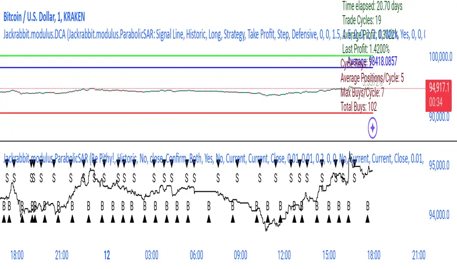
Jackrabbit.modulus.DCAThis is the Dollar Cost Averaging (DCA) for the Jackrabbit suite and modulus framework.
The blue line is the current average price of the asset.
The red line is the deviation boundary. Price action must be below this line for buys to be signaled.
The green line is the take profit. Price action must be above this line for a sell signal to be generated.
Here is a list of the settings:
Buy method: DCA or Strategy. DCA allows the module to decide buys based upon the methodology (step, price). Strategy added to the average on the basis of a buy signal from the strategy, but only when it is below the deviation and is the most organic of dollar cost averaging.
Sell Method. Take profit or Steategy. Take Profit sells the asset as soon as the price action crosses above the take profit line. Strategy sells on the basis of a sell signal, but only if it is above the take profit. Selling never occurs at a loss, with the only exception being the exit point.
Methodolgy: Step or Price. Stepping allows a fixed and uniform averaging ant percise intervals of deviation. Price is a very aggressive approach that will drive the average down on the basis of the difference between the average and the current price action. The price methodology is VERY high risk.
Take Profit, which describes the average profit percent of the combined positions.
Deviation, which describes the percent boundary for which price action must drop before additional assets are purchased.
Sideways Breaker: This algorithm breaks the sideways rut by forcing a purchase after X days, minimum 1 day.
Exit Position: Internal stop loss expressed in the number of buys.
It is important that when you establish your sell signal, ALL positions must be sold to ensure the average profit. If required, use a CLOSE ALL message provided by your platform. Also, any platform specific DCA or Safety Orders will cause losses as this script can not track their value. It is recommended that these features not be used.
The Jackrabbit modulus framework is a plug in play paradigm built to operate through TradingView's indicator on indicatior (IoI) functionality. As such, this script receives a signal line from the previous script in the IoI chain, and evaluates the buy/sell signals appropriate to the current analysis.
This script is by invitation only. To learn more about accessing this script, please see my signature or send me a PM. Thank you.
Special Momentum Oscillator
This is my proprietary momentum oscillator indicator.
It is an indicator that seeks to track the momentum of price actions.
When the oscillator is above zero, it is interpreted to reflect upwards price momentum.
Likewise, when the oscillator is below zero, it reflects downwards price momentum.
Additionally, there are overbought and oversold zones at 10 and -10 respectively.
When price action reaches these extremes, there is a likely tendency for a reversal.
The slope of the indicator can also be used to identify the general price trend.
The indicator has customizable alerts, and you can also set it to show buy/sell signals.
Please try it out and let me know what you think! :)

Market Waves Alpha All-In-One IndicatorMarket Waves Alpha Indicator is a part of the Market Waves All-In-One indicators. It provides indicators on top of the candles which give accurate information on where the market it heading. It is important to familiarize yourself with the different keys available in Market Waves Alpha Indicator . These indicators appear above each candle, but it is important to wait until the candle actually closes before reacting on them. To make things a little easier, we are going to look at each indicator on its own and compare it with market price to see how it performs.
Blood & Red Diamond
These are suppose to be showing you when there is bearish momentum in the trend. Blood & Red Diamonds mean strong bearish momentum.
Yellow Cross – Market Manipulation
This indicator can identify when there is market manipulation about to occur, so be careful with your trade! Let’s see it in action:
Red Cross – Bearish Indicator
The red cross above the candle shows that there is bearish signals showing, so be careful!
Green Dot
The green dot that appears above the candles on Market Waves Alpha Indicator is suppose to where there is bullish intent:
The image above shows 2 green dots that appeared on 1 hour time frame. Clearly, the green dot appear followed by a large spike in price.
Blue Triangle
The blue triangle on Market Waves Alpha Indicator lets you know when there is a trend change, so if price action currently looks bullish the triangle lets you know that we are now in a bearish zone. Let’s take a look at this indicator:
EMA Ribbon
EMA ribbon can be used to identify the trend. Price is above the EMA ribbon when the trend is bullish and below the EMA ribbon when the trend is bearish.
This indicator is recommended to be used with Market Waves Omega Indicator for additional confirmation:
Oasis Trend StrategyThis is a simple script developed to give a quick visual of trend on any given time frame.
This is a script that gives signals of trend switches. Can be used to for buying and selling signals.
On larger time Frames we use the Aqua and Fuchsia Clouds to express the larger time frame trends.
This can be used for long term swing trades especially useful with the 4hr, 6 hr, and daily chart to cancel out all the noise within the larger trends. The smaller Blue/Red Clouds can be used within trend if you are a skillful trader.
On smaller time frames (Intraday), we used the Blue and Red intraday price action. Is meant to be used
alongside with the Aqua/Fuchsia to create short term trades decisions within the short term trends indicated by the Aqua and Fuchsia.
The 9 ema is used to keep a close eye on short term directional changes.
You would want to see if price stays above or below this level along with its price action.
This should give you initial signs of strength or weakness.
The 55 ema (Black) is used to determine larger trend directional changes and for confirmation of trend shifts.
If interested, you can learn a lot just by watching the price react to these levels and can really visualize the price action that encompasses these averages.
We recommend that all traders study Technical patterns, Price action, Financial risk management, and other pre-trade planning strategies to minimize drawdown risk.
Please give us a like and a follow if you like this indicator. Its simple and very easy to use.
We are not financial advisors. We do not give financial advise. Please use this indicator at your free will.
We are not responsible for any financial losses or claims.
If you find this indicator very useful as I have, we do appreciate any amount of tips.
This will fund us to create more indicators to be made for your use.
BTC - 3PmVmmsnuLedg7umzVkLnarKRo43g6P5Tp
ETH - 0x9a1Ba8809687D8d9A1D32Ed1602abEef48060aF1
LTC - MAgqbC6Kev1x3L2GvNwzhZacyBRxCKJ8Mi
ZCash - t1UYRLzQxeaHCNYfA9cLChfBX5mbcNqworA
0x - 0x2B07D8BFB20b6eDb9A498113764082211cdFA2cE
Many free Tradingview users can benefit from our indicators as we employ many many useful indicators that can be toggled in each script to surpass the indicator limits.

Wasabi Tool: GBTC Premium IndicatorWasabi Tool: GBTC Premium Indicator
I'd like to introduce my new indicator, which is called 'Wasabi Tool: GBTC Premium Indicator' .
This indicator is to show the premium of the well-known Grayscale's Bitcoin Trust, GBTC in percent(%) .
It's been widely known that people can invest in Bitcoin via GBTC in their regular brokerage accounts and even in their Brokerage-linked 401k accounts. Yes, for those of people with their pension accounts, they have been able to invest in Bitcoin indirectly (eg. Fidelity's Brokerage-linked 401k) and to take advantage of the volatile price actions.
With the volatile nature of Bitcoin, the GBTC normally follows the exact price action, up or down, of Bitcoin. However, some exuberant interest in the investors and the limited supply of GBTC make GBC's price go much higher than its NAV(Net Asset Value) price per share, which is the amount of bitcoin per share of 0.00098247 BTC, also found at the Grayscale website, at the time of writing.
Until Bitcoin ETF becomes a reality, GBTC is a practical and viable option for 401k investors to invest in Bitcoin as of now.
You may find it useful to compare this indicator along with the Bitcoin trends found in Internet. The difference is that this indicator is to show the ACTUAL exuberance and eagerness by those of people who have restrictions in investing directly in Bitcoin for whatever reasons.
I hope you like the indicator.
Please subscribe and Like it.
Thanks,
Wasabi
---
안녕하세요. 와사비 입니다.
오늘 새로 만든 지표는 'Wasabi Tool: GBTC Premium Indicator' 입니다.
이 지표는 그 레이스케일 투자 회사의 트러스트 상품인 GBTC 가 실제 가치(NAV)대비 얼마나 프리미엄이 붙어 있는지를 표시하는 지표 입니다.
널리 알려졌다시피, 미국에서는 일반인들도 일반 증권회사나 심지어 401K라는 연금계정에서도 GBTC 트러스트 상품 투자를 통해 비트코인에 간접적으로 투자를 할 수 있습니다.
비트코인의 심한 가격변동과 마찬가지로, GBTC도 비트코인의 가격을 쫓아갑니다. 하지만, 투자자들의 열광적인 투자관심과 GBTC의 부족한 공급물량으로 인해 GBTC의 가격이 NAV (글 쓰는 현재 기준 1 GBTC = 0.00098247 BTC )로 표현되는 실제 가치보다 훨씬 많은 프리미엄(때론, 100%이상)을 내고 거래되어 오고 있는 실정입니다.
향후 Bitcoin ETF가 현실이 될 때까지는, GBTC상품이 401K 연금 투자자들에게는 현재 비트코인에 투자할 수 있는 현실적인 옵션입니다.
이 지표를 잘 보시면, 지난 2017년도에도 여러번 실제 가치보다 100% 이상 넘는 가격 프리미엄을 보인 것을 알 수 있습니다.
구글 트렌드가 사람들이 인터넷에 비트코인을 언급하는 구매와 직접 관련없는 관심레벨을 이야기 한다고 하면,
이 프리미엄 지표를 통하면 비트코인에 직접 투자하지 못하는 일반 주식 투자자나 연금 투자자들이 얼마나 높은 프리미엄을 내면서까지 투자하는지에 대한 실제 '광풍정도'를 가늠해 볼 수 있습니다.
도움이 되셨다면 구독+좋아요 부탁드립니다.
와사비 드림.
